

mundane (2019)
book, bookbinding, collection, graphic design, layout design
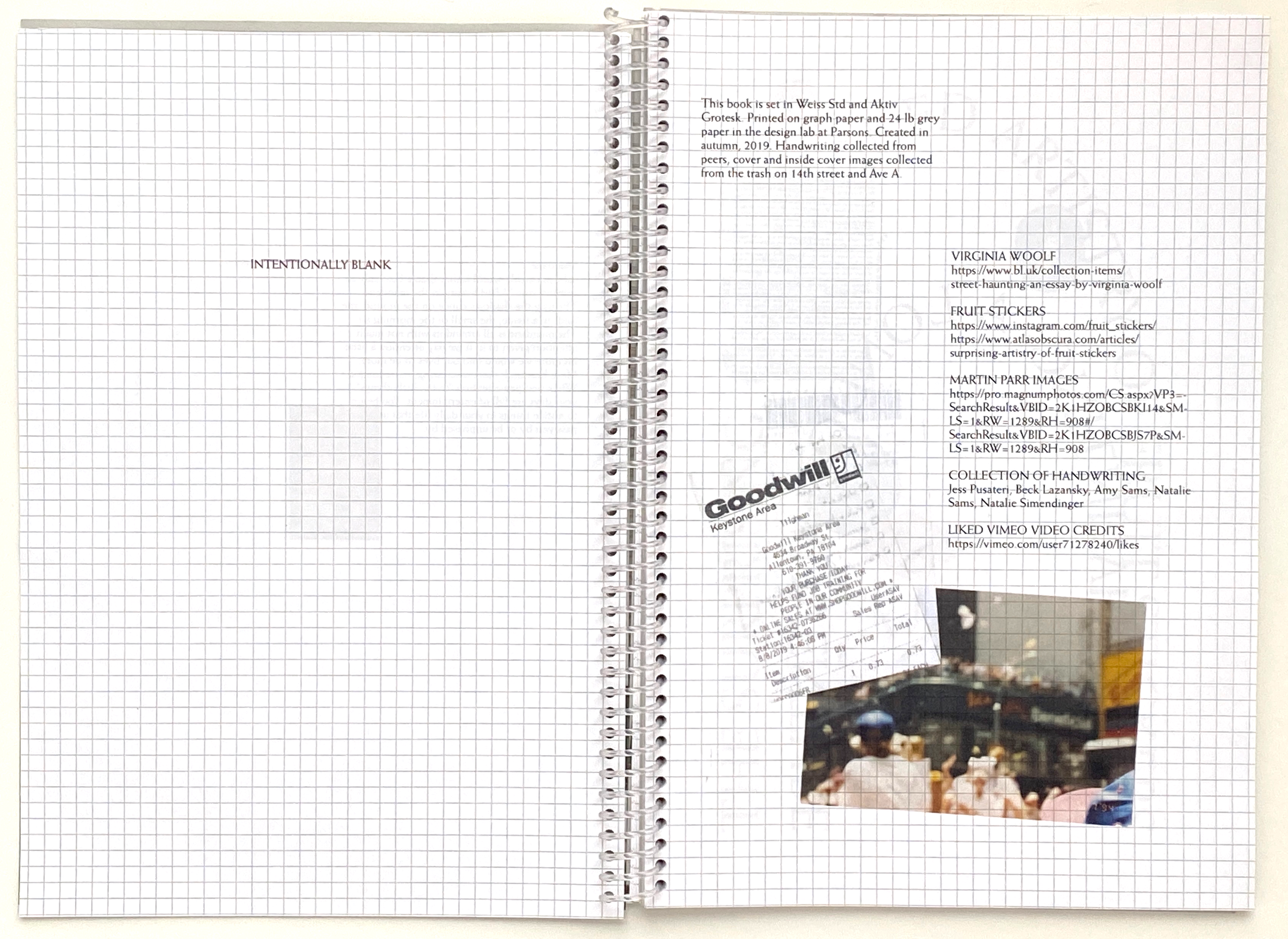
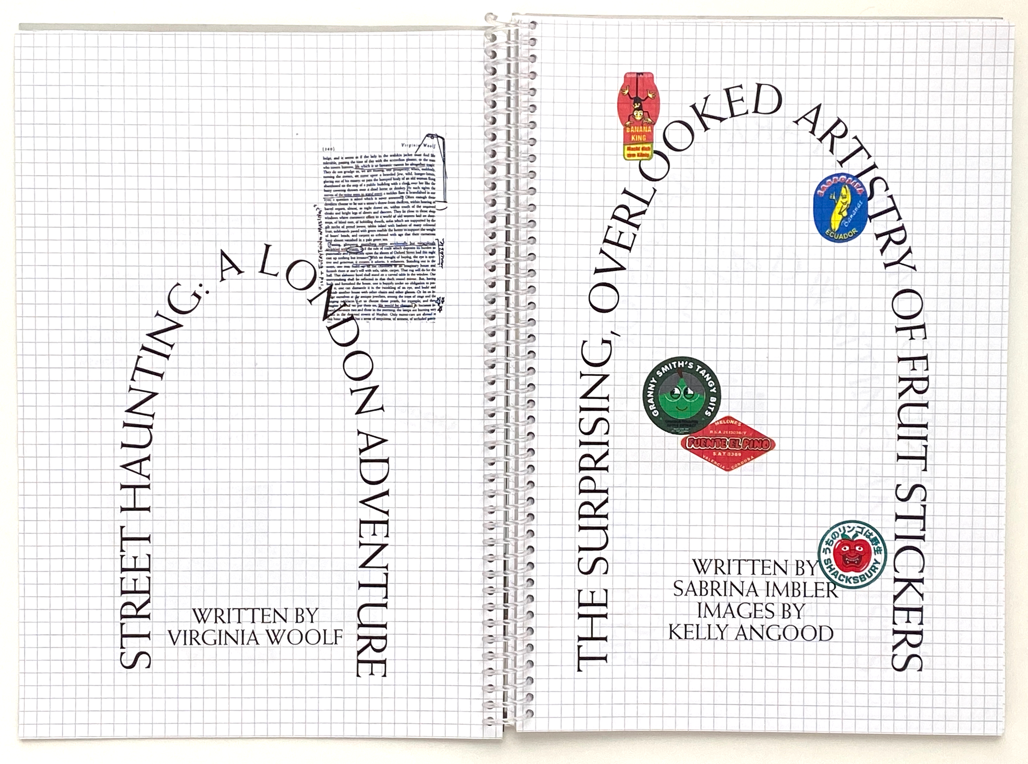
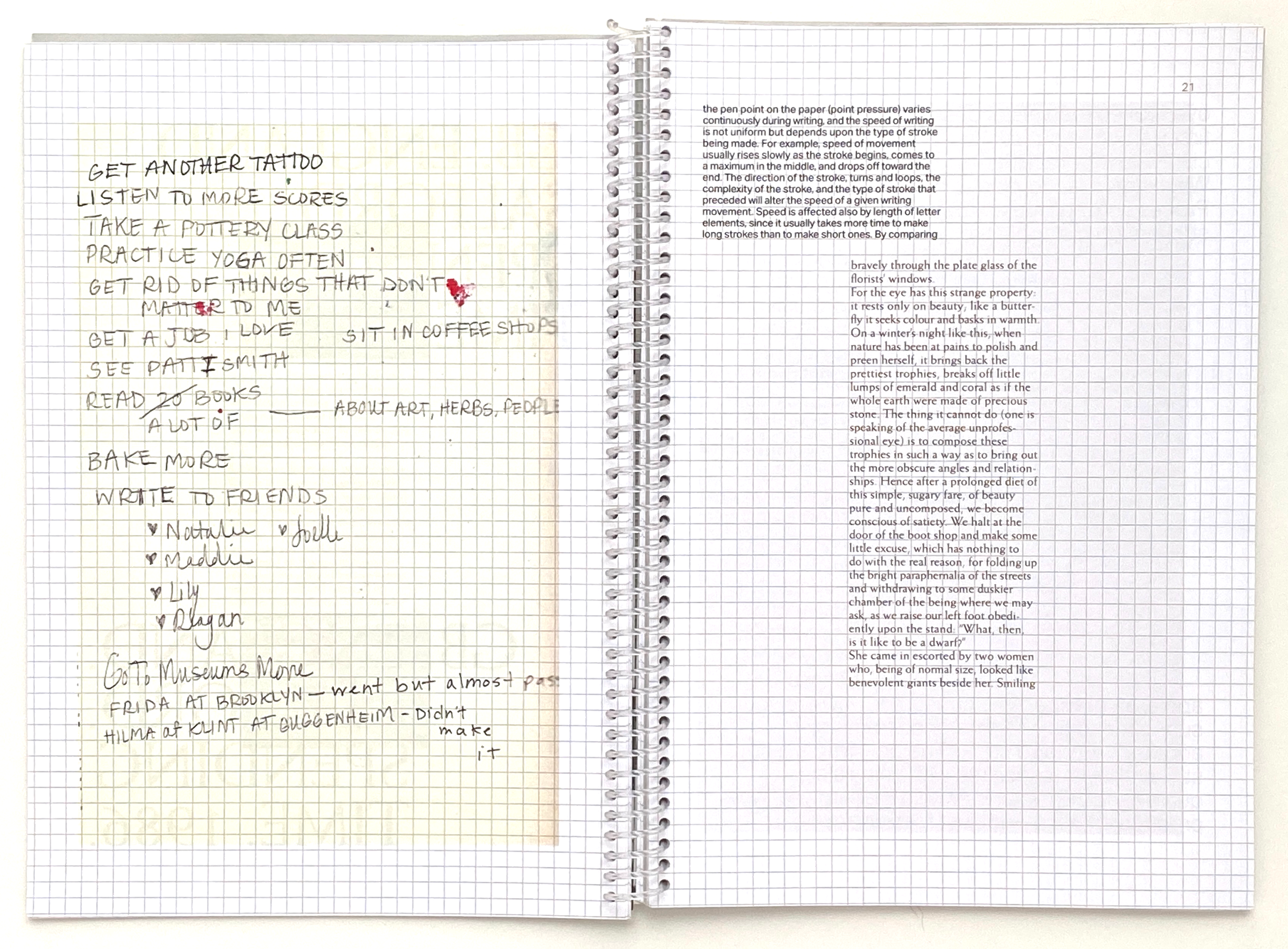
A spiral-bound book made by hand featuring found, scanned images. Stories of the mundane are intertwined with photographs of everyday life, handwritten lists and receipts, and fruit stickers. A brief intermission of stills from credit scenes breaks up the stories and epistolary artifacts. mundane was printed on grid paper.
Based on a single image, this book showed me to pay attention more to the mundane, and that this is what I truly appreciate and look for every day. The single image is of a simple window covered in a curtain with the shadow of some birds and flowers streaming onto it. After taking some time to think about where to go from here, I was walking around outside my apartment and found a bunch of photographs and film slides scattered by the trash. I picked them up, washed my hands, and used these images as further inspiration and part of the cover design.
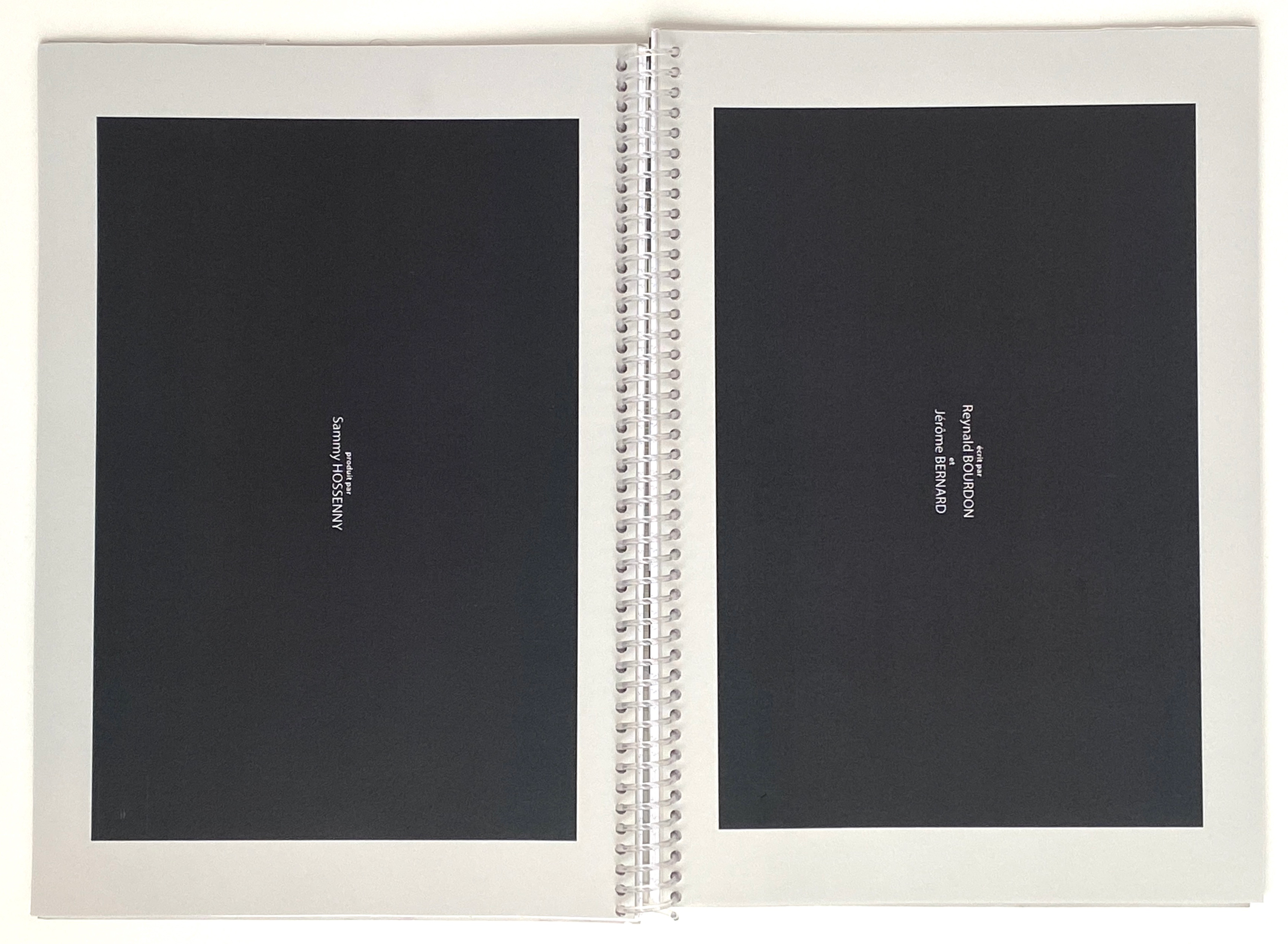
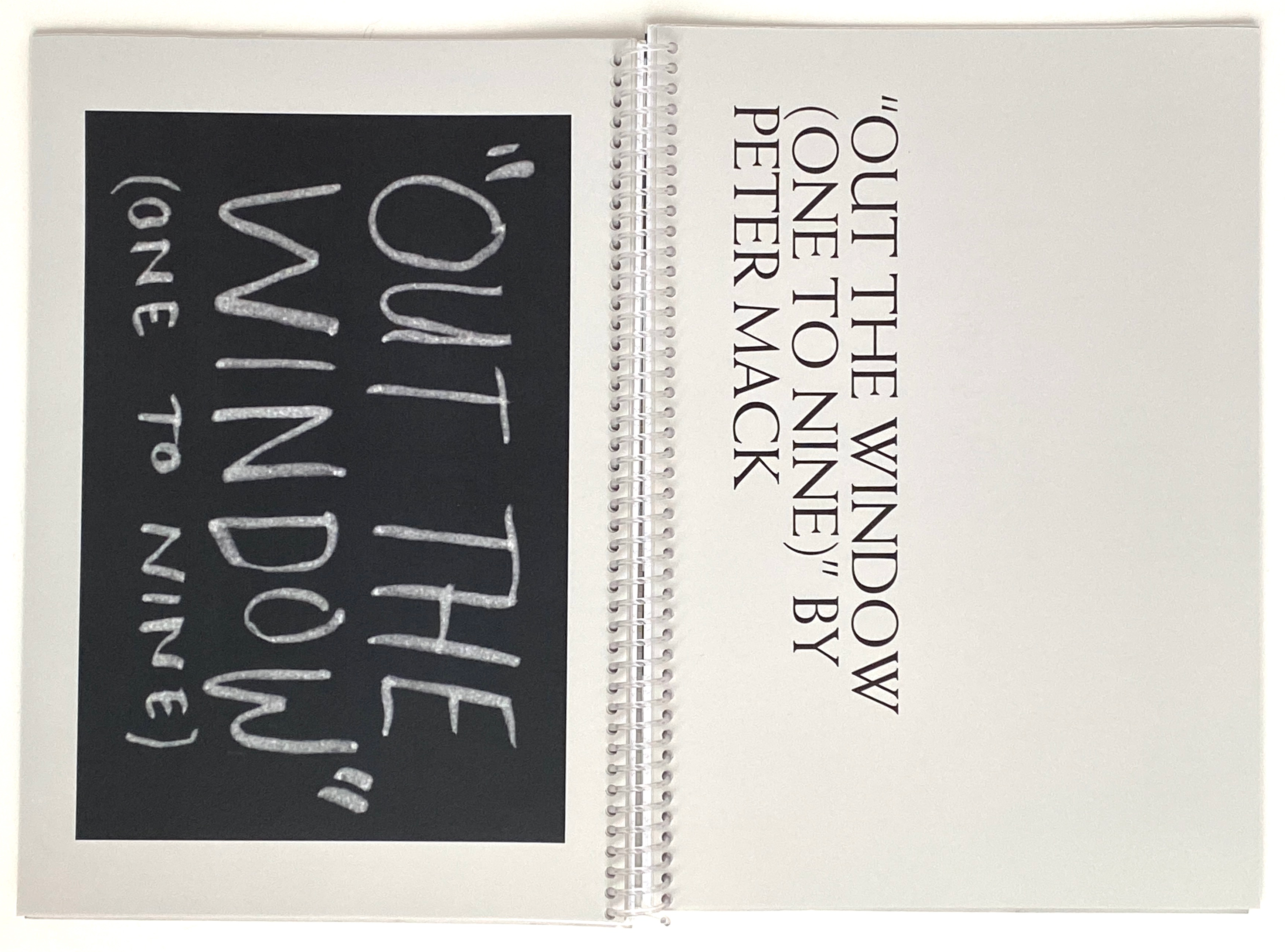
The content consists of a story that speaks on the mundane; Street Haunting: A London Adventure by Virginia Woolf, an article on a collection of fruit stickers, photos of everyday life by Martin Parr, and scanned in lists and handwritings I collected from friends and family. All of these items are intertwined, mixing the mundane with one another and in turn creating an interesting story that you have to flip through multiple times in order to fully read the entire content. Just about halfway through there is a break from all of these collections. In here, turned sideways to emulate a standard movie screen, are a collection of stills from credits of different short films. This is a moment of calm, repetition of something common but that is often turned off. Placing this in the middle is to bring attention to it and get the viewer to be aware of moments that are often overlooked.
I also focused particularly on the printing process and the book itself as an object. I printed this on grid paper, something that usually isn’t seen as anything all too special. The grid paper adds an additional element to the book that you have to view in the physical form, the digital design does not show the texture or the weight of the paper. The credits break is printed on soft, recycled, grey paper. The difference in texture also allows the viewer to more substantially notice the change in content and pacing. All of this comes together with the binding; square hole punch and a clear spiral.
I also focused particularly on the printing process and the book itself as an object. I printed this on grid paper, something that usually isn’t seen as anything all too special. The grid paper adds an additional element to the book that you have to view in the physical form, the digital design does not show the texture or the weight of the paper. The credits break is printed on soft, recycled, grey paper. The difference in texture also allows the viewer to more substantially notice the change in content and pacing. All of this comes together with the binding; square hole punch and a clear spiral.
